As a designer, I’m pretty emphatic in my belief that great design should be timeless and memorable. I also believe that logo design shouldn’t be presented as a mystical and magical process. My influences are some of the greatest graphic designers of the 20th century. Saul Bass, Paul Rand and Massimo Vignelli are just a few. They believed in boldness, simplicity and elegance. All of them have created logos that have existed for decades — think of IBM, AT&T, Westinghouse, American Airlines. All are iconic designers and are considered the benchmarks for great and lasting design.
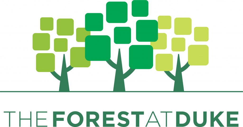
It is against this backdrop that Engine designed The Forest at Duke logo. While it’s always great showbiz to act like our work happens effortlessly and magically, the fact of the matter is, there’s a big amount of left brain thinking that goes into designing.
We tend to start off our logo design process by asking our clients a simple question: Where do you want your logo and brand to go? We use something called a Style Continuum.

It’s a nifty little tool. It helps our clients easily identify the tonality of their current logo and express how they would like their new logo and brand to look and feel. More important, surprisingly specific design direction comes from this exercise. In the case of The Forest at Duke, the blue circle on the left indicates that the client felt their old logo was traditional — expected, conventional and literal. The fact that they wanted something fresh, innovative and abstract (the yellow circle) allowed us to explore in a more specific area.
To help illustrate how a logo and brand can evolve from the literal to the abstract, we showed The Forest how the NBC logo changed from something that represented what they were initially about (in this case, radio broadcasting) to something metaphorical and abstract — a peacock. Even though the NBC peacock’s original intent was to brag about their ability to broadcast in color, it still remains relevant to this day.

To emphasize just how important this concept is, I often use this quote:

At this point, The Forest and Engine agreed that they wanted a logo that was contemporary, abstract, metaphorical and ambiguous. I can’t overstate how important this is whenever we design a logo. Not only does it minimize the already daunting design choices we have to make, but it serves as a contract of sorts — when we come back with preliminary designs, if the client says they wanted, say, something more traditional and expected, we can remind them that that is not the direction we all agreed we should explore.
The Forest logo we were redesigning was 25 years old. People were used to it, but it was clear that the logo no longer reflected the direction The Forest wanted to go. Brand equity is important, so before we went all Extreme Makeover on them, we explored incremental design changes. It was clear that none of these choices was contemporary, metaphorical or ambiguous. (Is it a metaphor for something? No, it’s a tree. Ambiguous? No. It’s a tree.) Plus, there was this brilliant and insightful observation by one of the greatest designers of our time:
So we added trees and tried some more abstract versions. (They’re not good, but that’s okay. You get to peek behind the curtains and see how the sausage is made, to horribly mix metaphors.)

At this juncture we had settled on a bright green color palette, and also worked on different typographical treatments. Dozens and dozens of tweaks later, we had our logo.

We believe it’s timeless in the manner of Bass and Rand. (I am not comparing myself to them, but simply trying to follow their design principles.) There’s metaphor and ambiguity, but best of all, the client is delighted with it, and with how we are building a vibrant, relevant brand.
 In the years I’ve been practicing design, one of the most important lessons I’ve learned is that people want and need to understand how I do what I do. While it’s kind of a buzz to pull the design rabbit out of the hat, de-mystifying the process and bringing along others for the ride is ultimately more rewarding. And it just happens to make my job a lot easier.


